Tru Identity Inc. Lead Designer
What the client needed

I was approached to design a desktop web app platform from the ground up to enable development of an MVP in order to gather customer feedback and interest. The product's main focus is on filling a gap in the supply chain management space — providing automated tools such as compliance status, vendor risk management, supply chain mapping, and more.

How I approached the work

I leaned in on understanding the problem space (given its specificity) and ensuring I could deliver an experience based on standard expected behavior and modern UI practices as a baseline.

Given there is no such product on the market, I wanted to gain clarity in usability without needlessly reinventing the wheel — allowing us to expand on the development of the platform as we further iterate on and discover user and market needs.
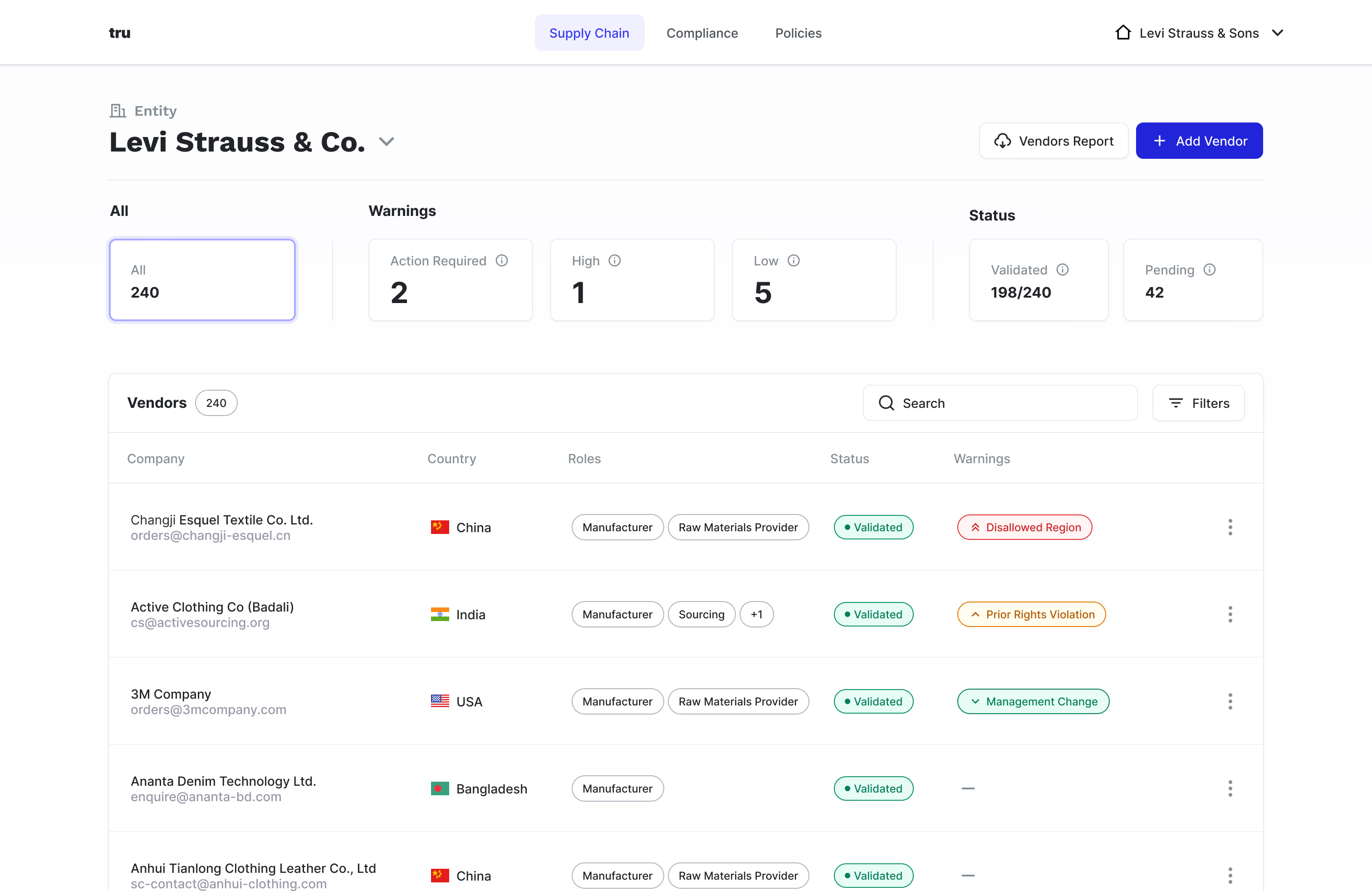
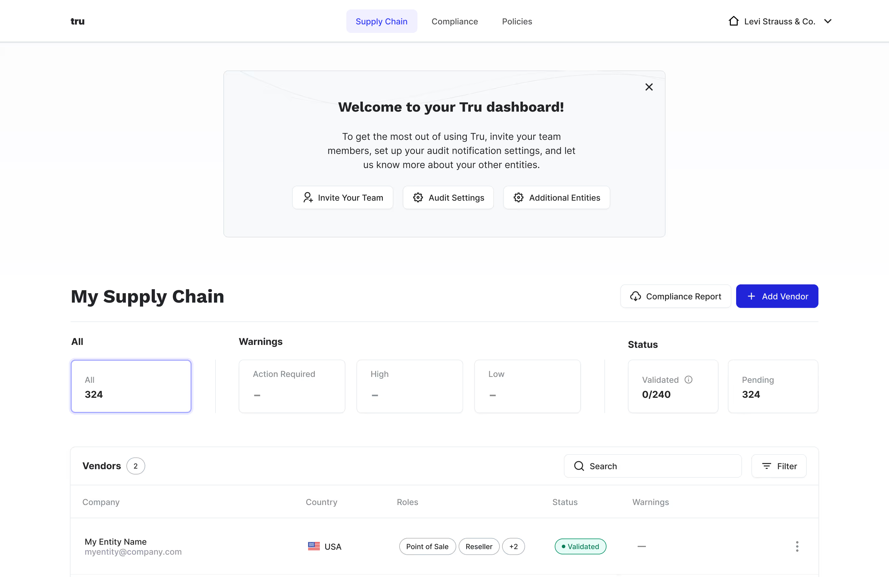
Tru Identity dashboard screenshot
👇 Here are a few snapshots from my process and decision making
Tru platform onboarding user interface
Involved onboarding

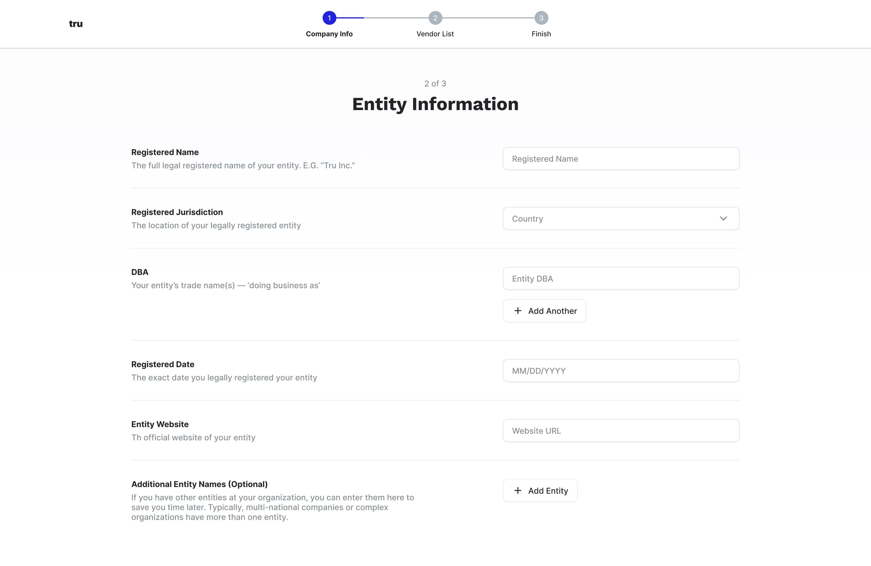
Due to the nature of the industry and compliance requirements — I placed consistency of form layout at the forefront and suggested we provide clear copy for each required field.

I also broke up the required information into a stepper to reduce cognitive load and to help with a sense of user completion.

Tru platform user guidance user interface
User guidance

In order to make sure users could successfully set up their workspace, I recommended subtle (yet non-intrusive) elements that would provide “steps” to help get them up and running.

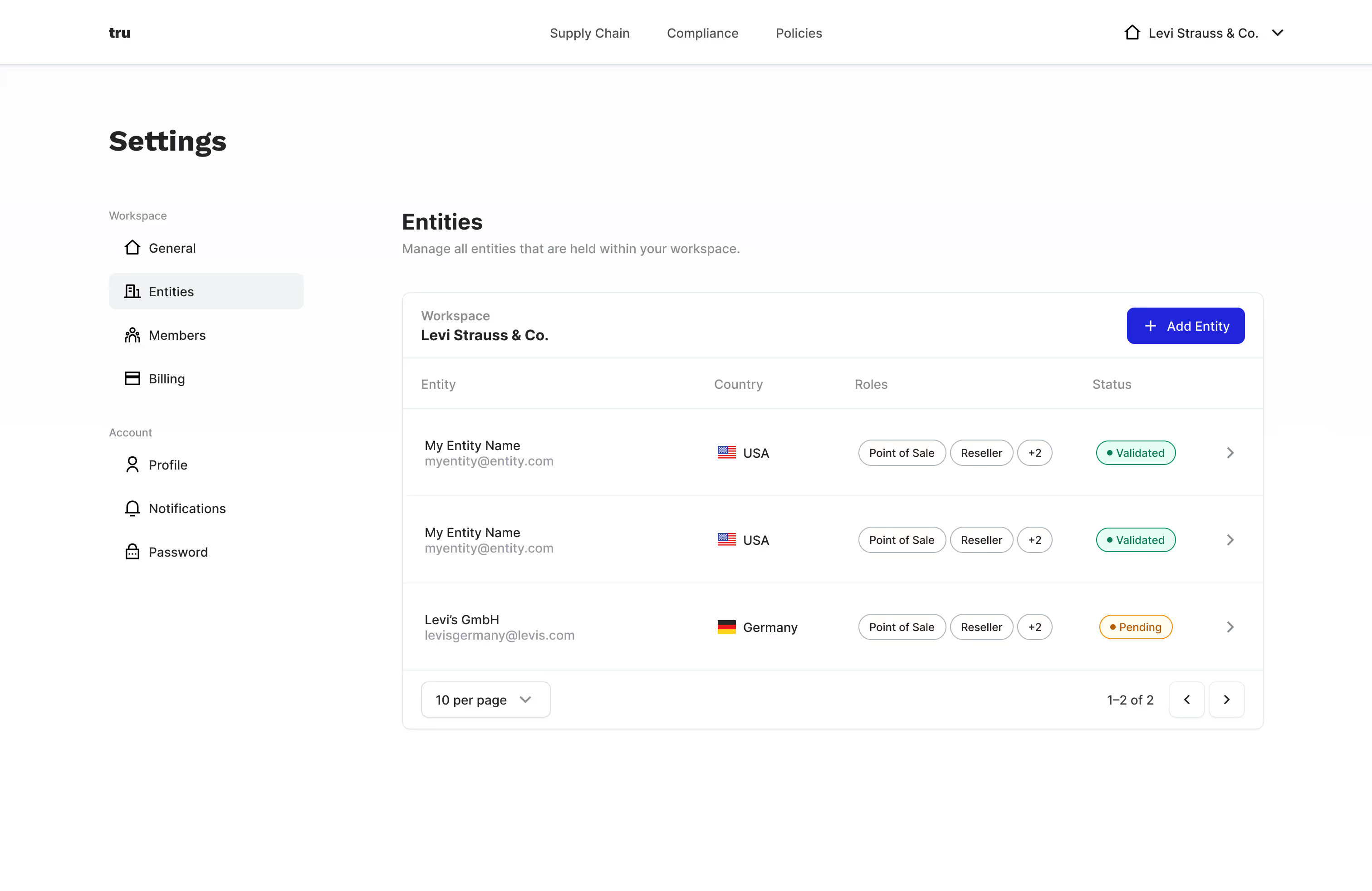
Tru platform settings page user interface
Setting the settings stage right

A product with complex user needs can easily fall into a habit of “design debt” rather quickly. I opted to establish patterns we could reuse as much as possible, allowing users to create mental models of what they are seeing (visuals) and what they perceive to be the case (experience).

In this example I created a clear distinction between the user and workspace in the sidebar, while reusing the already-established table for communicating the concept of entities.

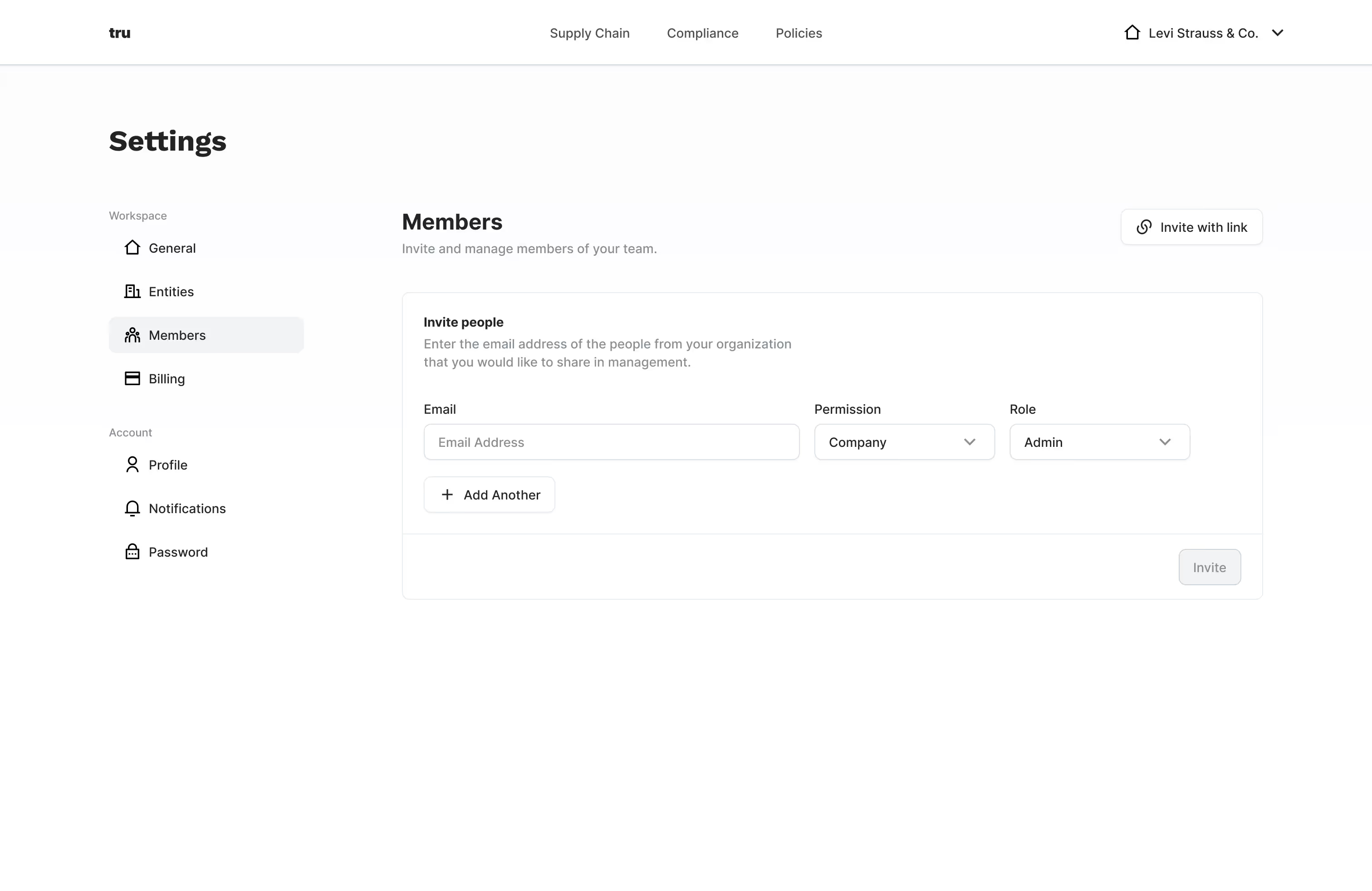
Tru platform design system example user interface
Design system in action

In creating a custom design system for the product based on what we call atomic design, there are often several cases where certain organisms won’t be reused, and new ones need to be established for specific use cases. Here is one such case, where inviting members is a specific action within settings which needed a custom solution.

Tru platform member invite user interface
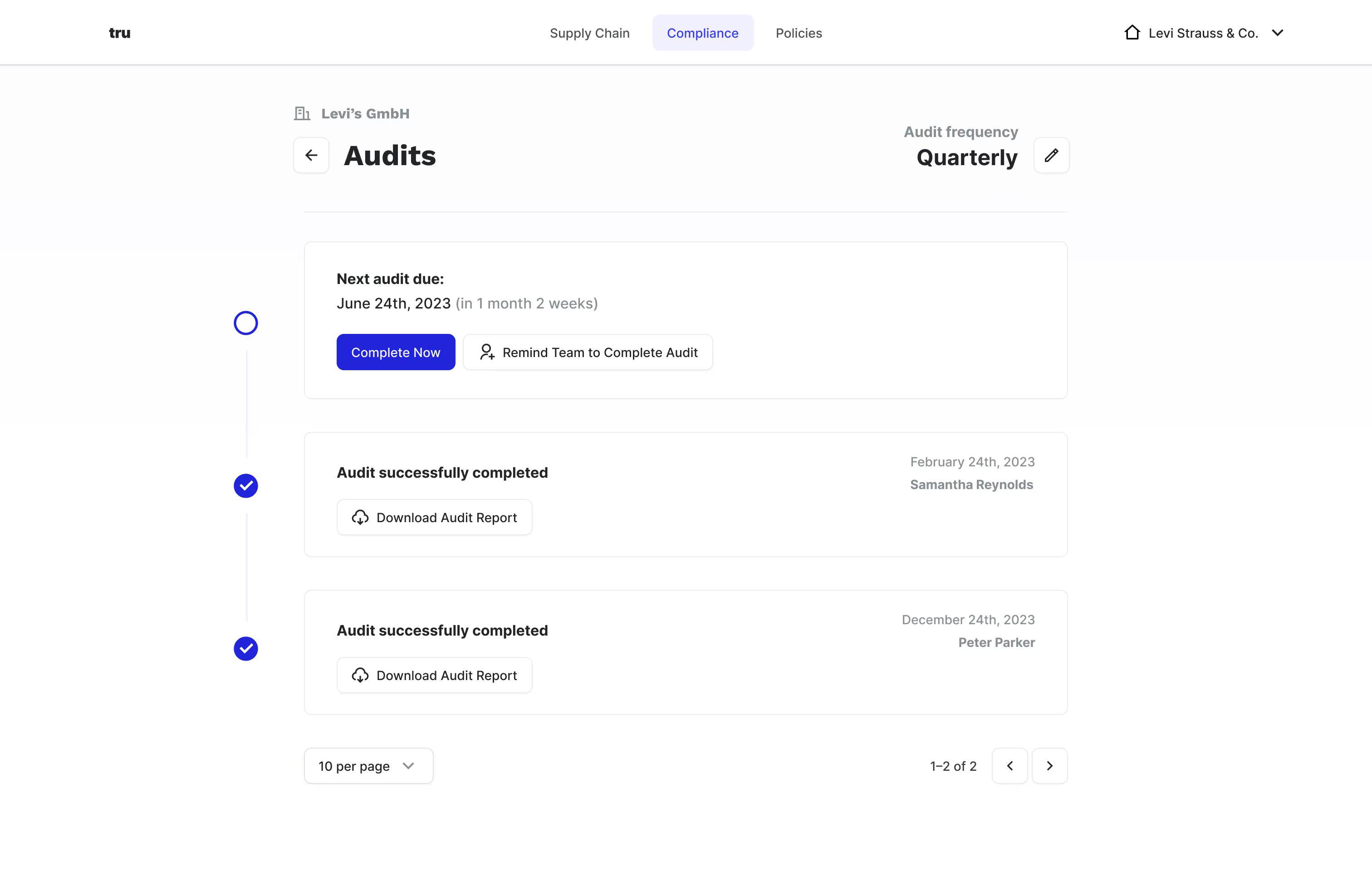
Solving for already-established workflows

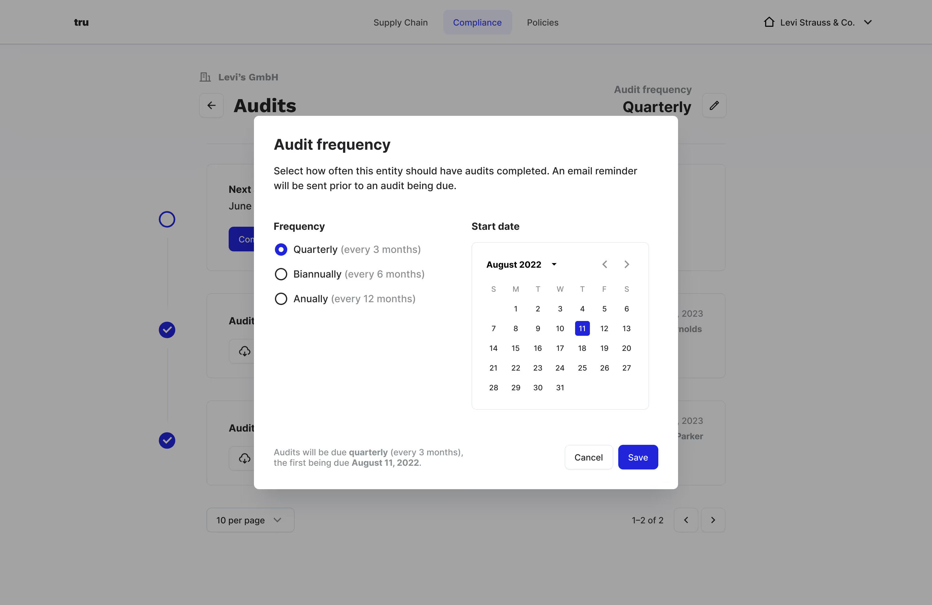
A latest feature we’ve been working on is compliance audits. In this case, there’s a balancing act between what workflows customers already have within this industry and how we can provide a clearer way to accomplish them. Here I proposed a more visually-oriented approach to tracking past and future audits, with an inline setting to adjust for audit frequency.

Tru platform modal example user interface
Modals are a user’s friend

There are a multitude examples of modals within the product, but here is one of them. Deciding which patterns to use always depends on the product’s context of use. For a desktop-only app like this, modals are an excellent way to provide the user with actions while not taking them out of their current flow. It often also allows for primary actions (e.g. viewing and completing audits) to be distinguished from secondary actions (.e.g setting the audit frequency).

View another project
CloudCampus
Redesigning edu remote desktops
View project →
Tru dashboard screenshot